
RESPONSIVE HEALTHCARE WEBSITE
A Redesign of a healthcare website

Overview
The project focused designing the Valorant Health (now Rainfall Health) landing pages while establishing a cohesive brand identity. This effort aimed to enhance platform credibility, clearly describe services, and offer an inviting user experience. By building user trust and creating a welcoming atmosphere for healthcare seekers, the redesign sought to elevate the overall user experience through modern design principles, intuitive navigation, and a compelling visual identity.
When was this?
Sep 26-Nov 12 2022
My role
Research, Visual Design, Prototyping, Front-End Development
Research and Planning
The design process began with extensive user research, including analyzing user analytics and conducting stakeholder interviews to identify needs and pain points. We conducted a competitive analysis to understand current design trends in the healthcare field, ensuring a well-informed and targeted approach. We created an empathy map to better understand who our users were and capture diverse requirements, guiding the design to meet various needs effectively. Wireframes and prototypes were created to visualize layout and functionality, followed by high-fidelity designs. This iterative process allowed for continuous refinement based on user and stakeholder feedback.
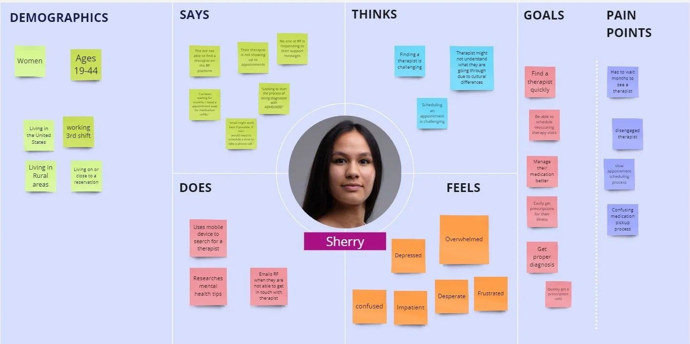
Valorant Health, Persona Empathy Map
Branding for Valorant Health
A strong brand identity was established, featuring a new logo, consistent typography, and a unified visual style to reflect the company's commitment to quality healthcare and patient trust. The color palette of blue, white, and red conveys trust, clarity, and action. High-quality images represent diverse healthcare scenarios and the user base, ensuring inclusivity, relatability, and professionalism. Detailed service descriptions enhance clarity, while modern design principles and intuitive navigation create a credible and inviting platform.
Style Guide

High-Fidelity Mockups
Mobile Responsiveness
Given that the majority of our users accessed the website on their mobile devices, we adopted a mobile-first design approach. The website was created to be fully responsive, ensuring a consistent and user-friendly experience across all devices. This approach prioritized usability on smartphones and tablets, providing easy navigation and an intuitive interface. By focusing on mobile-first principles, we ensured that the user experience remained seamless and engaging, regardless of the device being used.

Results and Impact
Performance Metrics
The redesign resulted in a 45% reduction in bounce rates. These improvements indicate higher user satisfaction, longer visit durations, and increased trust in the platform.
Increased Brand Credibility
Cohesive branding efforts significantly boosted the company’s credibility, presenting a unified, professional image that built user trust. This polished design and consistent messaging attracted more potential users and appealed to potential employees.
Impact on Investor Funding
The enhanced website played a crucial role in securing investments. Improved engagement metrics showcased the platform's success, making the company more attractive to investors and leading to increased funding opportunities.